The website of a major public university, with hundreds of pages and departments competing for a pixel at the homepage. It took 3 years to redesign it from the ground up. The University had to assemble a team to develop and manage it internally. My role was to train and guide this team to achieve a better user experience in the new website.
The website design was very participative, including students, professors, and staff. We had individual and group card-sorting, conceptual mapping, interviews, surveys, and a project weblog where anybody could comment on the proposed designs as they advanced.
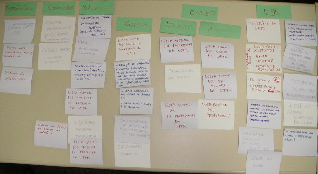
First, we formed groups of six people to apply card-sorting individually. The group had to put together their series of portal content cards and call on someone from another group to carry out the categorization as if they were a user.


It’s interesting to note that no two classification schemes were the same, even within the groups. This demonstrates the difficulty of reconciling users’ interests in a single portal. Soon, these individual sessions will be carried out in different units of the University and the results will be given appropriate statistical treatment.


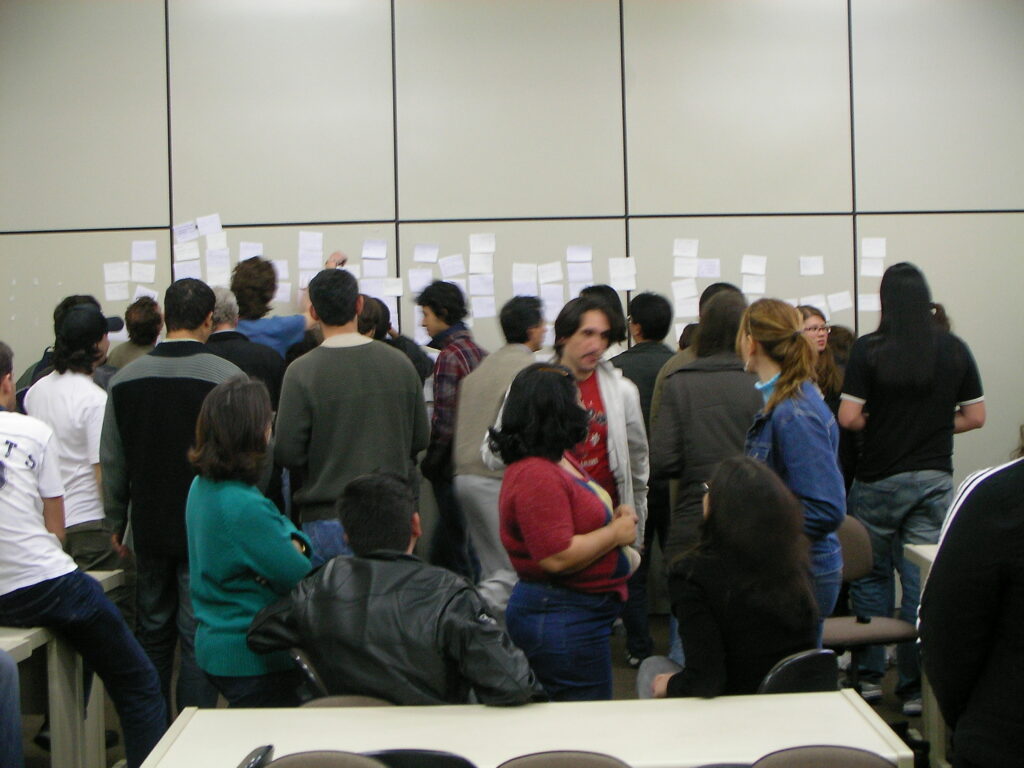
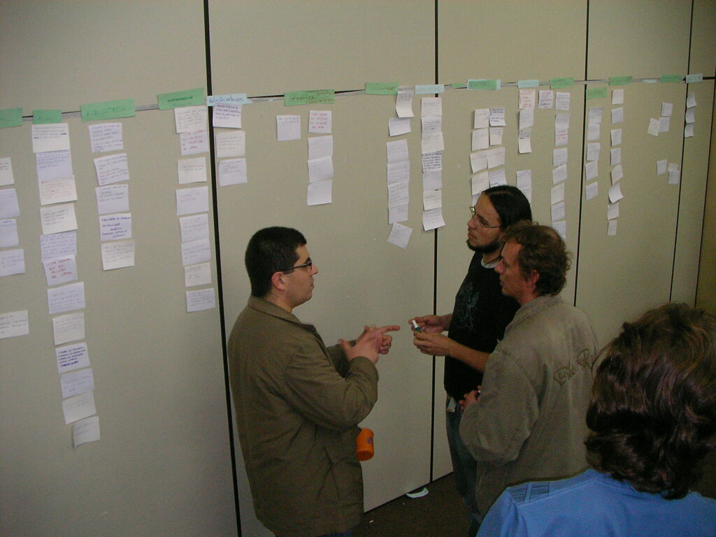
After the one-to-one, we invited all the teams to put all the cards they had created on a wall, eliminating the duplicates and grouping the similar ones together. It was a heated discussion!
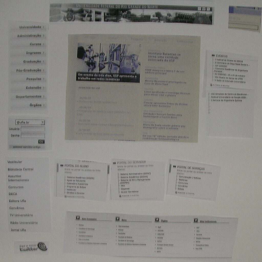
Finally, we applied a method called FIDO (Freehand Interactive Design Offline): we cut out pieces of the homepages of the reference portals and asked the groups to put together a homepage with them.

