Why are design researchers not so excited about reading and writing if that is an integral aspect of doing design research? In my view, designers are typically exploited in so miany ways, primarily for cheap labor. They are not expected to say anything, just give form to previously defined functions and content. In a critical approach to design research, designers can say their word and challenge the oppression structures they are part of. For that, they need to become good writers and also good readers.
This is a post-recorded guest lecture from the MXD Fall 2023 Research and Practice course, University of Florida, taught by Professor Maria Rogal.
Video
Audio
Slides
Full transcript
I will provide some practical insights on how, why, and for what reason I write. But before I go into that, I want to contextualize why it is so important. Well, in recent decades, design, in general, has prioritized function over form. As an example, I’ll give you this collision between a contemporary car designed for maximum driver safety and, on the other side, an old-fashioned car designed with maximum attention to styling when the design was more concerned with form. At that time, every vehicle had to be unique, on the verge of alien designs. This change is not just something that has happened in automotive design. We can see it all around us in digital technologies, for example, where function—measured by usability or user experience—has become much more critical.

However, underlying this shift between form and function is an ideology of transparency. Design tries to make the objects and services being created transparent, giving access to the world without having any stake or influence. Design has aimed to stay behind or hidden so that people would not pay so much attention to it. The idea was that design would not stand in the way of the user’s tasks.

A movie that depicts this shift is Minority Report (2002), a story about a world where mass surveillance became available and was managed through transparent interfaces, which at that time were visually compelling. Even though they aimed to immerse users in the world rather than take them out into virtual reality, the movie anticipated many trends that later became known as clean design or user experience design. This focus on transparency became commonplace in user experience design and many other fields.
What’s often missed in this conversation is that some designers made those interfaces. But if they need to stay out of the way with their designs, they seem to have nothing to say—there is no content in those transparent design interfaces. Is that so?
If we compare this to other cultural media products of that time, for example, when Jonathan Ive was the Vice President of Apple, every new product came out with a campaign or a video where he explained the best features of the design, how they came up with that form or even that function. However, this was not something the general public was used to—understanding and thinking about design in terms of authorship.
Everyone started to flock around Jonathan Ive, one of the few star designers people knew anything about. With most companies, you would never know who designed their interfaces. And even though more people became literate about design as a form-giving activity, recognizing different kinds of languages being used by designers—iconic languages, user interfaces, buttons, product surfaces, shapes, grammar, and even sounds—designers were still not necessarily treated or recognized as authors.

The reason for this is not that every company lacked leadership like Jonathan Ive but that most companies didn’t want someone from design at the top. Designers were mainly exploited as cheap labor. Jonathan Ive was the exception to this organizational and valorization structure in design work.
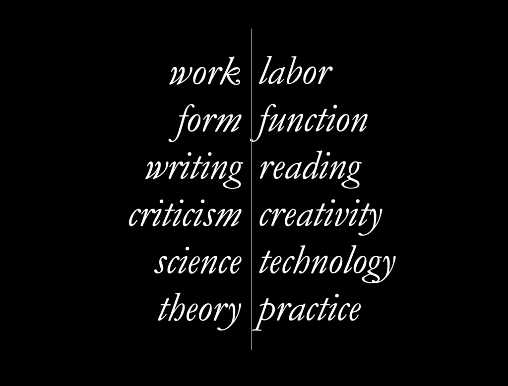
If we look historically at design, we see that most of the time, it has been considered labor, concerned with function and reading rather than form, writing, or authorship. The left side of these dichotomies—criticism, science, and theory—is privileged, while those on the right—labor, function, reading, creativity, technology, and practice—are seen as underprivileged. This distinction between social groups has been used to justify exploitation, with people on the right side considered to be doing less valuable work, thus deserving less compensation and recognition.
This ideology pervades all kinds of institutions, not just companies that design products. But in design research, we can challenge this. Designers from the right side of this equation can move to the left side and speak their word, defying such classifications. With that, I am inspired by Paulo Freire, the marvelous Brazilian educator who wrote about the importance of becoming literate about your world to change it.
Design research offers that opportunity, and learning how to write takes many forms. There are many ways to write design research. For example, we can write questions and hypotheses and define our interests. Then, we observe, interview, or hold workshops with users. New insights, needs, ideas, concepts, and ways of making changes arise from that. However, we must interpret, analyze, and check for biases and overlooked elements because we are part of a community of design researchers. We must present, discuss, and communicate. Afterward, we get new questions, hypotheses, and interests. It’s a circular process, but it could go in any direction in a nonlinear way. As I mentioned before, the common feature in these activities is writing—not just with text but with various languages.
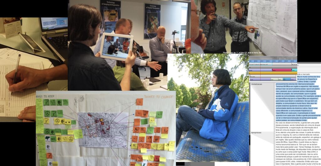
Here are some pictures to illustrate these concrete aspects of writing across different media, styles, and genres from my PhD. When I was observing users, designers, architects, engineers, healthcare practitioners, and people in public spaces, I took notes in notebooks and on Post-its, and I extended my understanding of writing to include video recording, which I also see as a kind of writing, a way of observing and describing what’s going on.
These writings are connected like a palimpsest, an evolving text that tries to make sense of a complex situation. As design research takes place, if designers want to become good writers in many different genres, they must also become good readers, practicing reading in these different styles.
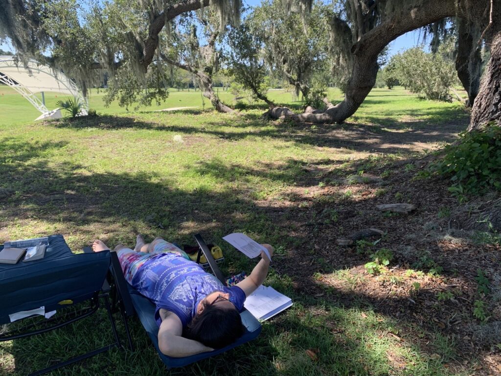
However, reading habits can help or hinder design research writing. Here’s a picture of me reading a paper in a marvelous place, having a good time. Not everyone reads like this. For some, reading is a ritual where they need to remove all distractions, sit straight, and focus entirely on the text. For me, though, this would make me sleepy. I need pleasure while reading, so I’ve adapted my reading habits to fit my constitution, enjoying both text and nature. However, everyone has different preferences, and experimenting with reading habits can reveal which are constructive and destructive. For instance, I lost some eyesight after reading in the dark for many years during my PhD, and now I wear glasses. Before that, I didn’t need them due to my bad reading habits, but I learned the hard way to read in better environments. Well, perhaps I didn’t learn so much, but I want to say that reflecting on reading habits is very important to becoming a good reader and getting the best out of your readings.
There are other ways beyond habits that can structure your reading. For example, literature reviews, also known in design research as desk research, are methods to organize reading beyond personal habits. You don’t just stick to your likes and dislikes; instead, you disclose the literature review process or method to your readers, allowing them to scrutinize whether you’ve done a thorough job or overlooked something.
A literature review can be as simple as gathering all the relevant books on a topic in a library or from your collection and writing a summary and discussion of their key points. You write about how different readings intersect or challenge one another—that’s, in a nutshell, what a literature review is about. Of course, online searches can provide even more material to compare and analyze, but you must drill down using selection criteria to make the task manageable.
For example, typing broad philosophical questions like “Who am I?” won’t yield many results. But if you narrow it down using specific criteria, like material written between the 1980s and 1990s, you can get more specific answers. Google Scholar offers some options, but other search engines provide even more filtering tools. For example, I’ve got 418,000 results here, which is too much for a literature review.
A good literature review narrows the scope to what you can reasonably read and analyze within your time, and that’s the key to managing the vast amount of research material out there. Once you start browsing search engines, you’ll find more papers than books on design research. If you’re new to the field, you might wonder why that’s the case.
Well, I’ve gathered some numbers and figures to help interpret this. Looking at my average publishing times for papers, you’ll see that conference papers get out into the world much quicker than book chapters. I haven’t written and published an entire book in English yet to compare this, but even writing a chapter takes more than a year, whereas a conference paper can be published in about half a year. Journal articles fall somewhere in between, with the most extensive variety of periods, but even so, book chapters take longer. That’s why conference papers show up more often in search results—because they are published faster.

And why is the journal article the most exciting format for research? Because it’s in between these two extremes: the book chapter, which has less structure, and the conference paper on the other side, which is more structured. The journal article, or the scientific article in general (which can also be presented at conferences—some conferences require the scientific article structure, by the way), has a very structured text format. Even the abstract has to follow specific rules for presenting the content.
Most scientific articles have an abstract, an introduction, a methodology section, a results section, a discussion, and a reference list. This is because it helps compare articles and facilitates indexing in search engines like Google Scholar. Google Scholar is already trained to find references in the reference list, allowing for better collective knowledge accumulation, which is the goal of any science.

This structure is shaped by the normative, or so-called scientific method, which typically involves observing the world, questioning it, generating a hypothesis to explain what’s going on, predicting what will happen if you run an experiment, trying to change the world, and observing the results. If the hypothesis doesn’t work as expected, you reject it and formulate another one, repeating the process until a theory is derived from the results. This theory can explain what’s been observed and extend further based on supporting evidence.
This process can be organized into four major sections: introduction, methodology, results, and conclusions. That’s how the scientific article got its structure from the traditional scientific method. Nowadays, however, and for many years now, scientific methods are not so linear or straightforward—they have many branches and variations. Therefore, scientific article structures are also varied. For instance, you may find articles presenting results before discussing the methodology if it helps clarify the paper’s purpose.
There are many situations where it’s hard to distinguish between different sections. You may encounter information that is part theory and method, and you can’t easily separate them. That’s why this paper structure is just a suggestion and is hardly ever mandatory for writing a scientific article. But even when not strictly structured, every scientific article tries to pack a lot of information into a small amount of space, so it’s often necessary to reread it until you fully understand it.
Each time you reread, you get better at understanding the topic. You’re not just reading for the words, sentences, or content—you’re familiarizing yourself with the collective knowledge accumulation that is science. Similarly, writing a scientific article requires rewriting the same sentence, paragraph, or title several times. This process of rereading and rewriting can be daunting, but it leads to better results as your language becomes more specific.
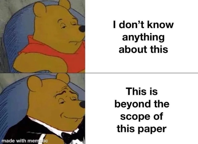
There are some jokes and memes about this process. For example, someone may initially write, “I don’t know anything about this,” but after becoming more familiar with how papers are written, they might rewrite it as “This is beyond the scope of this paper.” The latter is more precise because it focuses on the science behind the statement and the role of the paper in the collective knowledge accumulation process. It’s not useless to rewrite and polish the discourse. Rewriting is an opportunity to reread, cite relevant work, and clarify what you know or don’t know. When you realize you don’t know something, you might say, “This is beyond the scope of this paper,” and refer to another paper that addresses the topic.
Citing other authors doesn’t guarantee that you’ll be cited in return. For example, I’ve found that my most cited papers have fewer references than my least cited papers. This means that citing many people doesn’t necessarily lead to more citations for your work. There’s no direct correlation between these numbers. As you can see, the number of citations my papers receive is currently less than the number I give to other papers. This may change in the future, but we don’t cite other papers to be cited ourselves. The purpose is to recognize good work. If our work is considered good, it may be referenced—or it may not—because there is always controversy over what constitutes good research.
Decisions about what is good or bad, or what is worth recognition, are influenced by many oppressive relationships and historical patterns of oppression. For example, research shows that work done in the Global South or by oppressed authors generally suffers from citation inequality or citation injustice. I’ve been part of a collective that looked into citation injustice in Human-Computer Interaction. Oppressed authors receive far fewer citations than privileged authors, that is well established.
Here are a few relationships that can contribute to this. Typically, oppressed authors conduct counter-hegemonic research, which is often considered irrelevant, useless, or even politically persecuted because it is framed as ideological work rather than scientific work. These categories of oppression tend to accumulate. Such authors may be located in the Global South, lack permanent university positions, be non-white (e.g., Black, Indigenous, or people of color), be women, be disabled, or face other forms of marginalization that prevent them from reaching top academic positions where they would be recognized as bonafide authors.
Why is citing the oppressed so important? Because it can help reverse epistemic injustice by citing the citeless. You avoid citing the usual sources and instead, explore ideas and concepts that are often neglected because they are put forth by misrecognized people. This can also be a way to seek innovation from the margins, where society’s contradictions are more intense, providing more possibilities for change and innovation.
However, citing the citeless requires reading the least read, known, and commented texts, which can be harder but is very rewarding. I have personal experience with this through my involvement in the Alvaro Vieira Pinto Research Network (Rede Alvaro Vieira Pinto), a network of Latin American collaborators. The network focuses on recognizing the work of Alvaro Vieira Pinto, a Brazilian philosopher who also worked in Chile and produced original philosophy. However, due to political persecution, much of his work was lost and only recently rediscovered.
One of his major works, O Conceito de Tecnologia, published 18 years after his death, is an incredible piece of philosophy of technology. It anticipated in the 1970s what was only discovered and discussed by the emerging field of science and technology studies (STS) 30 years later. The only difficulty in studying Vieira Pinto is that he writes in a redundant philosophical language. He tries to be plain and avoids using complex philosophical jargon, leading to lengthy explanations. For example, Consciência e Realidade Nacional and O Conceito de Tecnologia are over 1000 pages, making them time-consuming to read.

Since you’re reading so much text, it’s easy to forget what you’ve read before. That’s why it’s essential to take notes. When I first read Vieira Pinto, I would highlight sentences using a pen and a highlighter, summarizing main thoughts and adding blank stickers for possible concepts. I wouldn’t write down the concept at the time; I just marked it for future reference, as if telling my future self, “Hey, if you flip through this book later, you might find this concept compelling.”
This is a very subjective way of reading, as I’m essentially preempting my own thoughts in the future. Sometimes, I go back to those blank stickers and wonder why I put them there, but most of the time, I can recall the context, and it helps me get one of the key points well-defined or at least well-marked. On a second read—especially with books like Vieira Pinto’s that require multiple reads—I write labels for the main concepts on the stickers, and I sometimes write in the margins or draw diagrams to make sense of the dense philosophy.

And a third read, already a write, connects and relates those different readings. I try to make sense visually using conceptual maps or IBIS systems (Issue-Based Information Systems) and systems like Compendium, which I’ve used for a long time—since I started my PhD. They enable you to attach notes to each visual icon on the map. These notes can be extensive, and you can open them in a pop-up to write down whatever you need for later checking. You can search these notes and use database-like activities to relate the different information you’re collecting.

There is a methodology behind the Compendium software called dialogue mapping. It was developed for people who wanted to figure out how to deal with contradictions in a discourse, in a conversation. They map the main ideas, the pros and cons of the different ideas, the questions that arise, new ideas, and so forth. This is called an IBIS notation. I use it flexibly—sometimes I follow the notations, other times I don’t. Most importantly, I use visuals to get an overview, a bird’s-eye perspective of the conceptual space I’m mapping.
Sometimes, I use this conceptual space not just for organizing my readings but also for structuring my writing. For example, while writing the introduction to Diseña 22, a special issue on design, oppression, and liberation, I made a map of the main contradictions faced by the papers on that issue. We had between seven and eight papers, and after reading them, I mapped the main issues visually in a circle. I looked at these issues, trying to find what was common among them. I saw that the structures were talking about oppressive and liberating structures, which became the main focus of the editorial.
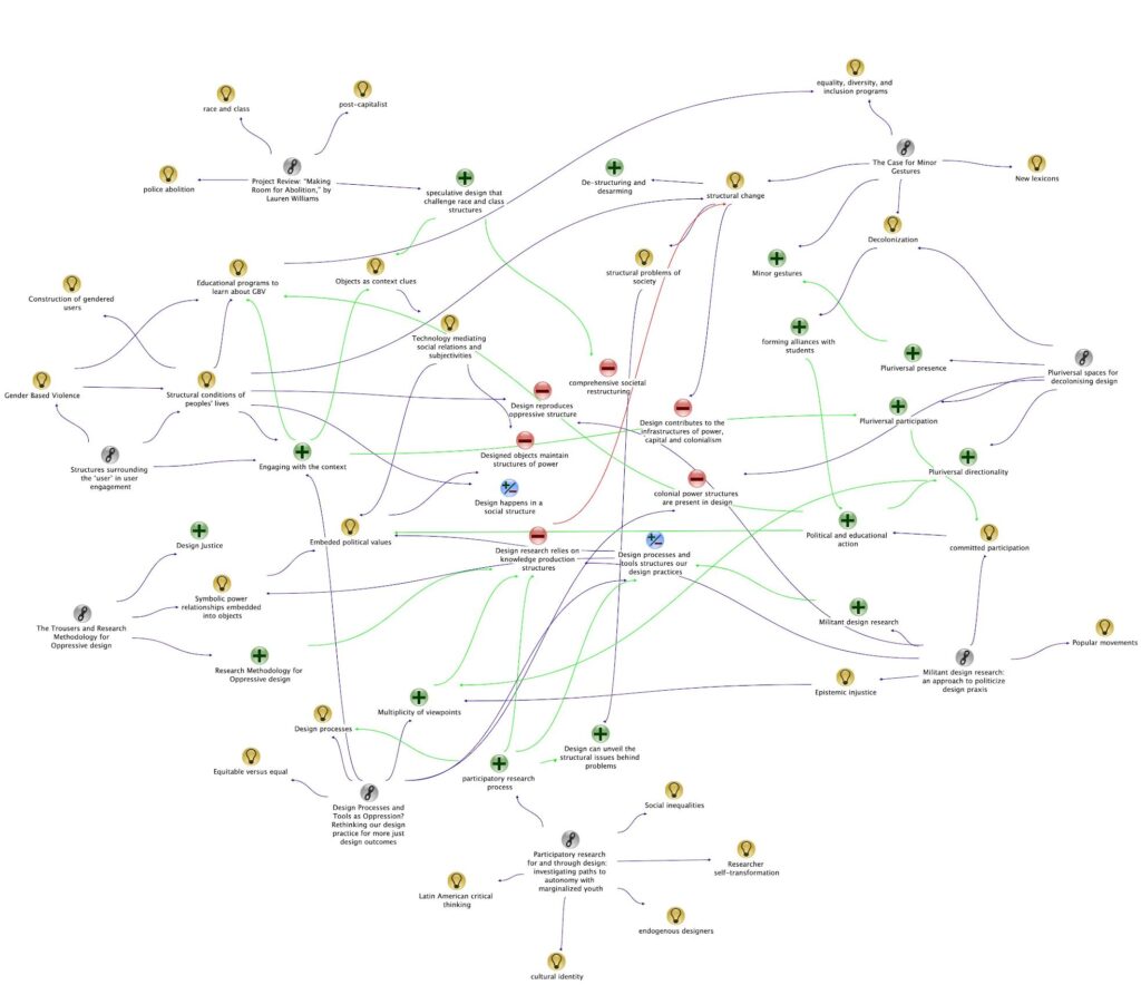
Writing like that is like making puppets talk to each other—each paper is a talking puppet. You create a dialogue between them in your text. You write that author A said this, author B said that and then you offer your interpretation: “We should look for C, something else.” That’s how you understand the collective activity of scientists and design researchers trying to develop something. If you are a reader with that mindset, you feel like you’re part of this puppet party, with different puppets expressing their thoughts.
Every time you cite an author, you impersonate them, saying what you think they said. But it’s not exactly the author speaking—it’s your interpretation. I call it a puppetry activity because it’s the reader’s interpretation of what the writer wanted to convey. And that’s fine. If you cite the reference, the reader can look up the originals and make their mind. But if you don’t cite or acknowledge the authors and their ideas, or you don’t structure the paper to include that social context, you lose the opportunity to understand how this collective activity is organized.
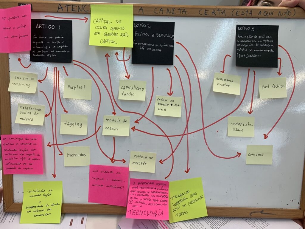
Finding out who’s behind each puppet, what they are talking about, why they are doing it, and the intentions behind it—political interests and cultural aspects—is very important. You can even make note of that while reading. For example, you can use color coding schemes to underline parts that reveal the author’s biography or writing context. You can also break down different parts of the paper. Sometimes I use semantic highlighting: I use pink for problems, gaps, hypotheses, research questions, and objectives (the starting points of the research). Yellow is reserved for theoretical concepts or the most important ideas. Green is for results—evidence, discoveries, implications, recommendations.

You could develop your highlighting system. This is just an example, but after highlighting, you can extract the key elements and create different visualizations. This is what I typically suggest my design research students do. They extract the main parts of the papers and put them on sticky notes using the same color code they highlighted. You can compare, for example, three articles, where the titles are written on black Post-its and the major theoretical concepts are laid down in the middle. You’ll see that some papers use the same theoretical concepts, which allows you to discuss common threads.
If I’m reading digitally—which I avoid when possible—I first highlight on a tablet using Adobe PDF Reader. It’s a simple app, and every time I close the file, it saves the highlights, which is helpful because I can open the file in any PDF reader and still see them. But if I want to reread and revise, I need to annotate, and the free version of Adobe Acrobat doesn’t allow that. So, I use another app called Notable, but there are many other suitable apps. With an Apple Pencil, I pay more attention while annotating, which makes my reading more precise, though it takes longer. I do this primarily for texts I’m heavily investing time in, especially those I’m writing or co-authoring.

In both annotation methods, the original PDF files are altered, and I can see the changes in my folders just by looking at the icons. I can quickly check which articles have been read and decide whether to extract parts for citation. Having this overview and organizing readings into nested or hierarchical folders is crucial because sometimes I don’t recall a paper’s title or author but remember the topic. This allows me to return to the folder where it’s stored. Of course, I can also search by keywords, but sometimes we forget the exact keyword, though we remember the overarching topic.
Organizing these digital papers carefully helps prevent accidental plagiarism. If I forget to cite something I’ve read and rely on someone else’s ideas without giving credit, reviewers or editors might accuse me of plagiarism. So, I always go back to my past readings to ensure I give proper credit. If I’m serious about this, I use Zotero for reference management. Zotero stores PDFs and captures metadata for each entry, allowing you to generate a reference list in any format you need. Once classified, you can reuse these references in other papers. Zotero also allows sharing folders with co-authors.
One of the most essential tasks when citing is finding the passage you want to reference. Sometimes, you remember a book but not the specific quote or page number, especially if it’s long. In a hurry, you might not take notes or need to check if the idea repeats elsewhere in the book. I’ve tried using ChatGPT for this. Once, I asked it to find a quote from The Falling Sky by David Kopenawa. It provided a quote: “The earth has no end, but it’s being destroyed by the smoke of the white people’s factory.” I thought, “Wow, that’s very critical!” But when I searched the book, I found that the quote wasn’t there—ChatGPT had invented it.
So, you must be critical when using AI tools like ChatGPT, as they can generate incorrect information. It’s excellent for quick overviews or starting points, but always verify the sources. For example, I used it to find anti-colonial scholars and was introduced to authors I hadn’t heard of, like Silvia Rivera Cusicanqui. ChatGPT can be useful for rewriting, rephrasing, and expanding existing text, but it’s less effective for generating entirely new material. Think of ChatGPT as an active pencil—it helps you, but you need to guide it and verify what it produces.
If you struggle with starting on a blank page, one interesting way to begin is by transcribing something you’ve said or presented, like a lecture or talk. Record yourself and then transcribe it. AI tools are quite good at transcribing nowadays, even in different accents of English. I use Whisper, from the same company that developed ChatGPT. It’s a very useful system that can run locally on your computer.
If you still lack feedback or collaboration, consider working with a real person. Co-authoring papers is one of the best writing experiences because you learn so much from interacting with others. I co-write most of my design research, and you can do that in creative writing as well. In 2019, at UTFPR, my students and I wrote a wearable manifesto about politicizing design. It was a big event, and students were excited to create a digital version to share more easily.
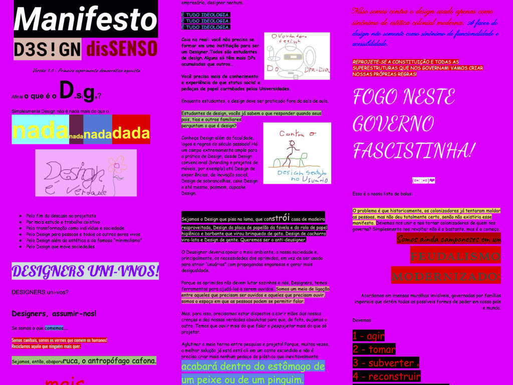
The result broke most of the graphic design rules the students had learned because they were concerned about whether they were learning something useful for Brazilian culture or merely colonizing the Brazilian visual scenario. One student wrote a research paper about the experience, which was published in the Art, Design, and Communication in Higher Education journal. It became one of the most cited papers in my career and was crucial for that student, who is now pursuing a master’s degree.
As you can see, writing design research is part of doing design research. It’s not a separate activity but integral to the research process, and it can be just as enjoyable as designing. When you write about design, you’re designing your future designs—metadesigning. Not just your designs but the designs of others who will read your work and may change how they approach design. That’s why it’s a collective design activity.
My recent writings aim to challenge oppressive structures and promote liberating designs in the design research field. These are the references for this presentation, and you can check them on my website later if you’re interested in reading them. You might gain new insights that differ from what I’ve just said—this is my interpretation of those readings. Thank you very much, and see you in the next lecture.
References
Angelon, R., & van Amstel, F. (2021). Monster aesthetics as an expression of decolonizing the design body. Art, Design & Communication in Higher Education, 20(1), 83-102. https://doi.org/10.1386/adch_00031_1
Conklin, J. (2005). Dialogue mapping: Building shared understanding of wicked problems. John Wiley & Sons, Inc..
Gomez, C. J., Herman, A. C., & Parigi, P. (2022). Leading countries in global science increasingly receive more citations than other countries doing similar research. Nature Human Behaviour, 6(7), 919-929. https://doi.org/10.1038/s41562-022-01351-5
Kopenawa, D., & Albert, B. (2013). The falling sky: Notes from a Yanomami shaman. Trans.) N. Elliott and A. Dundy. Cambridge: University of Harvard Press.
Poderi, G., Marttila, S. M., Saad-Sulonen, J., Van Amstel, F. M., Teli, M., Tonolli, L., D’Andrea, V. & Botero, A. (2022, August). Relationality, commoning, and designing. In Proceedings of the Participatory Design Conference 2022-Volume 2 (pp. 255-258). https://doi.org/10.1145/3537797.3537879
Vieira, P. A. (2005). O conceito de tecnologia. Rio de Janeiro: Contraponto, 2008.
Vieira Pinto, Á. (1960). Consciência e realidade nacional. ISEB.
Van Amstel, F. M. C., Gonzatto, R. F., & Noel, L.-A. (2023). Introduction to Diseña 22: Design, Oppression, and Liberation (2nd issue). Diseña, (22), Intro. https://doi.org/10.7764/disena.22.Intro

